Historically, most fast food restaurants have built their success on one core idea: deliver the same offer no matter where you are on the planet. For a long time we have all enjoyed seeing identical products coming off the fast food production line, feeling reassured by the factory-like ambiance that speaks of reliability and uniformity. Burgers, fried chicken, pizzas, chips and the like were simple, unsophisticated foods, which inhabited a simple, unsophisticated environment.
But now it seems all that has changed. Increasingly, fast food restaurants and even coffee bars are redefining themselves through the design of their retail outlets and are rewriting the rulebook. The ‘one look for everywhere’ approach, which traditionally made sense and helped to underscore a brand’s identity, has begun to look downmarket rather than consistent, and impersonal rather than recognisable. Consumers expect a more premium experience and the cookie-cutter strategy that dominated the sector is rapidly losing traction.
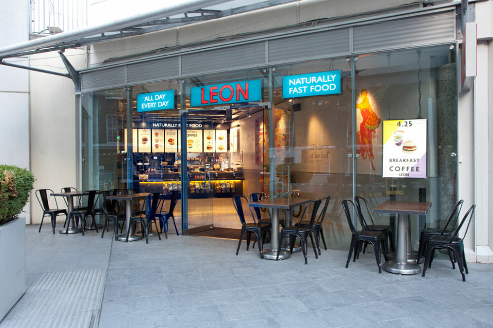
Part of the reason is the artisan ethos pioneered by the small players. Brands like Bill’s and Leon, – both of which have less than 100 UK sites – tapped into the zeitgeist by borrowing design cues from aspirational domestic interiors and as a result made ambiance the essence of the brand. Fashionable industrial lighting, quality natural materials like wood, stone and metal, quirky buildings, intriguing props and unusual artwork all work to give customers an authentic sense of place.
Big brands are now tapping into the trend and are making the expression of their identities more nuanced. For instance Starbucks has morphed itself to fit the high end neighbourhood of Conduit Street in London with an outlet which downplays obvious branding. Instead it has the atmosphere of a chic apartment. It feels like a personalised space and uses all manner of bespoke or ‘found’ fixtures and fittings: artwork from old teaboxes found in Bolton, shelving made out of fallen oak trees from Wales, floorboards salvaged from an old hotel. The result is a laid-back lounge-like atmosphere which blends in with the locality and therefore says far more about the brand than saturating the space with corporate colours and logos. At the same time the brand is pioneering new hi tech offerings elsewhere in London which better suit the time poor office worker in locations such as Canary Wharf. Starbucks is going for the diversified Holy Grail of hospitality – being all things to all men.
Meanwhile, KFC, the epitome of a fast food brand, is also making the same strategy work. Its Bracknell outlet launched a radical new look with brick panels, copper lighting fixtures and handwritten signs by artists. The sense of stylish domestic interior is evident through ‘kitchen tables’ with pendant lighting which evoke the idea of shared family meals, while the semi- open plan kitchen makes food preparation feel more intimate. The iconic KFC colour-ways, graphics and visual identity take a back seat and allow the environment to become the brand hero
The KFC brand is very flexible in it’s creative delivery. For example, the new US concept is an unashamed return to the old days of fast food restaurants with super brash branding dominating inside and out in a bold pastiche of its original 50s outlets. The overall design is very retro – there is nothing subtle to find here. Once again it proves that brands operating in different countries, or even different localities within a city, can express themselves in ways that suit local tastes and lifestyles and yet remain true to core brand values.
 Working over the past years on the new generation KFC concept and the fast expanding LEON chain, rpa:group has gained valuable insights into the rapidly changing landscape of fast food and we are now delivering bespoke spaces that fit different people and different behaviours. Just as the media landscape has fragmented over recent years to become a myriad offering of speciality tv channels, blogs, websites and magazines, so too are hospitality brands at last realising that one size does not fit all.
