Shenzhen. MYP Design
The Qianhai Dream Park Sales Center lies at the core of Shenzhen’s industrial and service areas, a key district at the junction of the Greater Pearl River Delta that incorporates Guangdong, Hong Kong, and Macau. Its strategic location in Xinqiao Street offers fluent roads extending in all directions, facing Shajing East Ring Road to the East, Shangnan Road to the South, Liaosheng Road to the North, and a metro station within a one-kilometer radius. On top of that, the Phoenix Mountain Forest Park, situated two kilometers East, provides a charming natural environment.
Mr. Ma Yiping, the founder of MYP Design, served as the project’s lead designer. His design language fully integrates building structures, natural landscapes, and interior design, carefully managing spatial elements to convey a spiritual atmosphere of unparalleled freedom.

The renovation took place after two years of use to provide visitors with a different atmosphere.
From Kyoto to Shenzhen
Kyoto, the cradle of Japanese Wabi-sabi aesthetics, is a city that portrays the aesthetic consciousness of an era. Standing at the gate of the Kennin-ji temple, the hands of a watch no longer move with mechanical precision. Instead, they rotate rather slowly. Does modern-day Shenzhen preserve its cultural aesthetics to the same degree as Kyoto?
Like the allure of the Ping An Bank by the window, Shenzhen’s aesthetics remain elegant, clean, and gracious within a one-of-a-kind architectural style. The accomplished design of the city entails aesthetic considerations that portray the research, exploration, and commitment to Chinese culture behind the development of every project. Inside, the correct use of light and hue is essential. The color palette is immaculate. Flowers on the coffee table, a painting on the wall, a sculpture, a chair, everything becomes part of a graceful landscape. Like Dwelling in the Fuchun Mountains, a classic scroll painting more than ten meters long, the project slowly unfolds before life to admire, influence, and wander through aesthetics.”
Ma Yiping
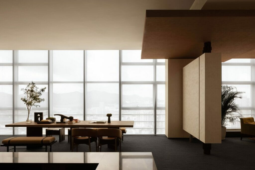
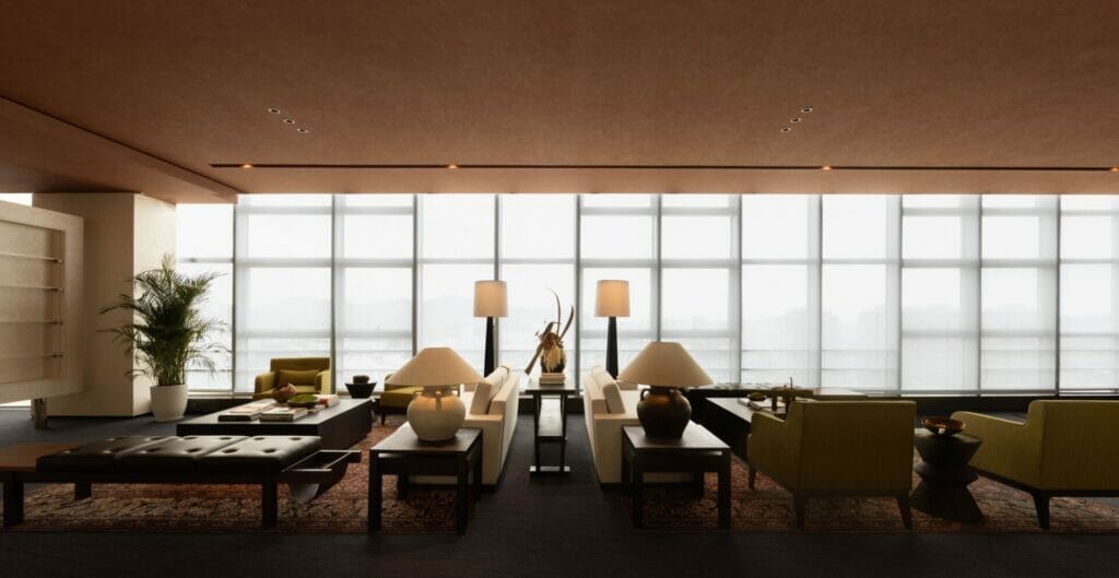
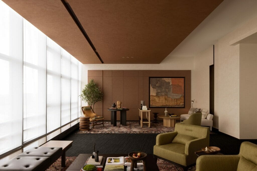
The space shaped like a stylized “L” is on the 19th floor of the building. The outer side is composed of an architectural glass curtain wall that offers an outstanding view of Qianhai. The exceptional visibility brings in the magnificent scenery. However, it also complicates indoor light control, testing the designer’s ability to shape the depth and level of the space.
The designer faces the challenge of a unilateral light source at the front of the project. In addition, the depths on both sides are slightly uneven, and the circulation paths are long and narrow. Such circumstances call for a thoughtful design that breaks with the conventional model rooms in the market. Instead of applying features like luxurious, complex, or surprising visual elements that generate an attractive atmosphere, the designer decides to create a relaxed space. The design language divides the project into private and open areas, adjusting light sources and structural blocks to draw pleasant perspectives.
Furthermore, spatial tones and shades are carefully defined, while selected art pieces and decorations match the variety and style of the materials. Altogether, the design language creates an uncomplicated and warm space that feels like “home” instead of the common commercial project.
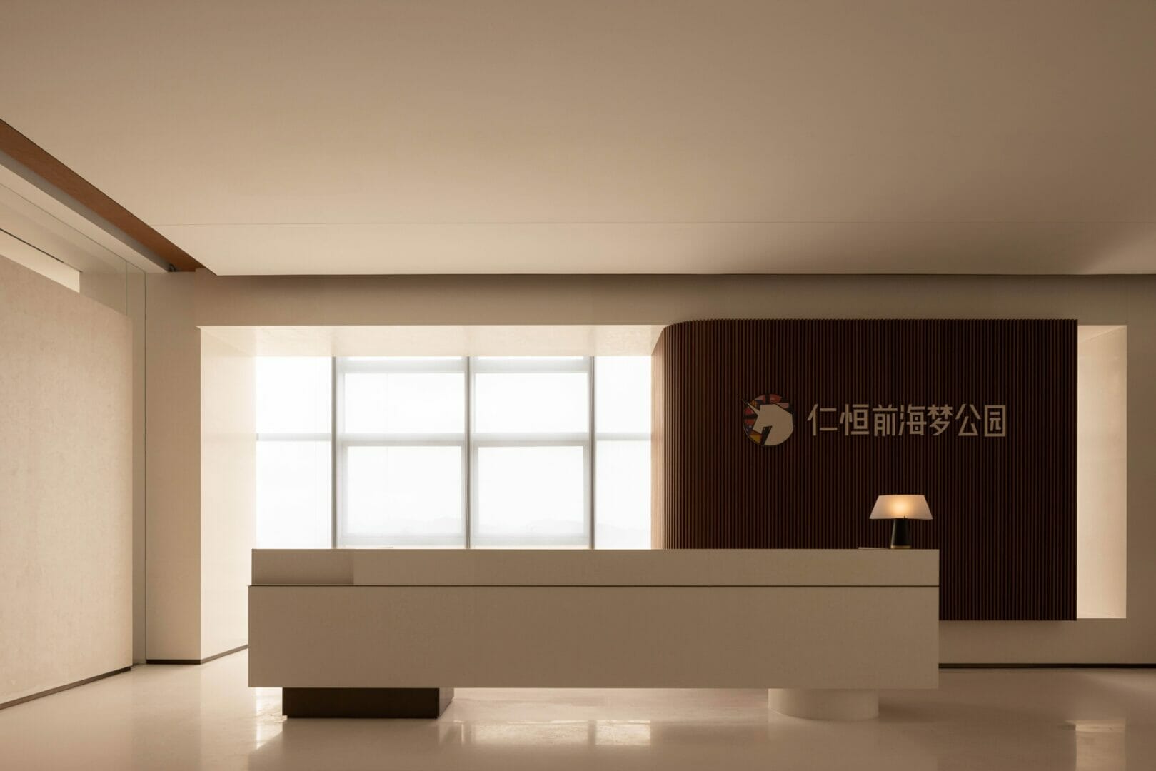
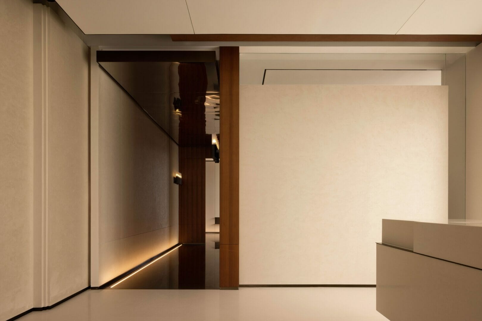
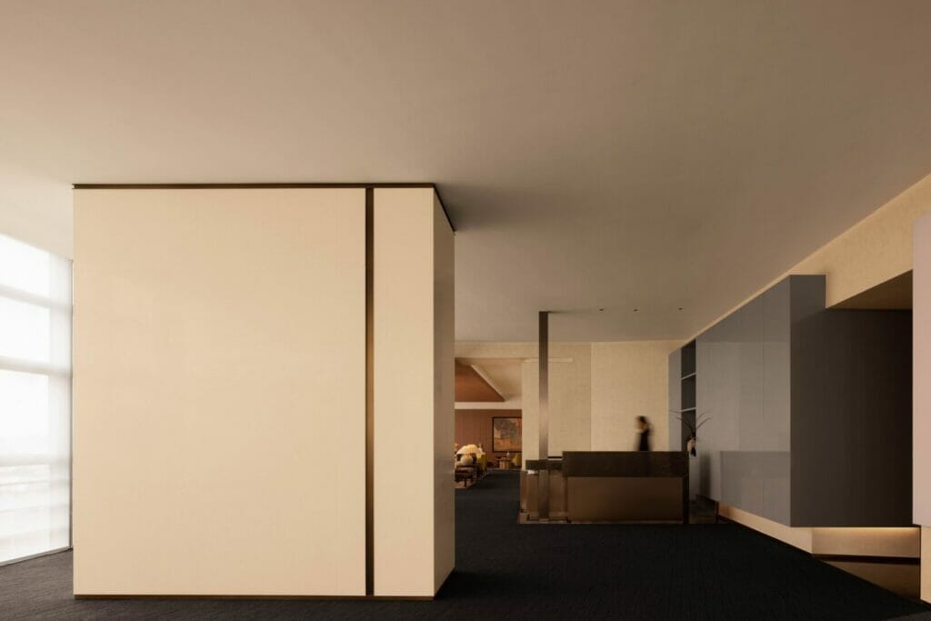
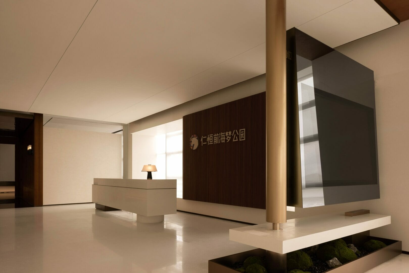
In the reception area, visitors are welcomed by the glass wall that illuminates the space. A geometric curtain composed of stone and wood veneer surfaces defines the functional area and controls the amount of light that enters the room.
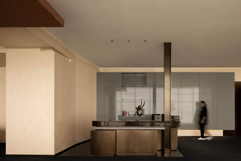
Neat geometric blocks set the spatial tone of the project. The front desk of minimalist horizontal lines is matched with vertical bronze columns. To the right, a miniature landscape of mossy rocks evokes refinement and moderation, while a suspended shelf offers corporate publicity and creates a division between spaces.
The VIP reception room is set to the left of the reception hall. On the opposite side, the layout defines a public space to carry out daily activities.
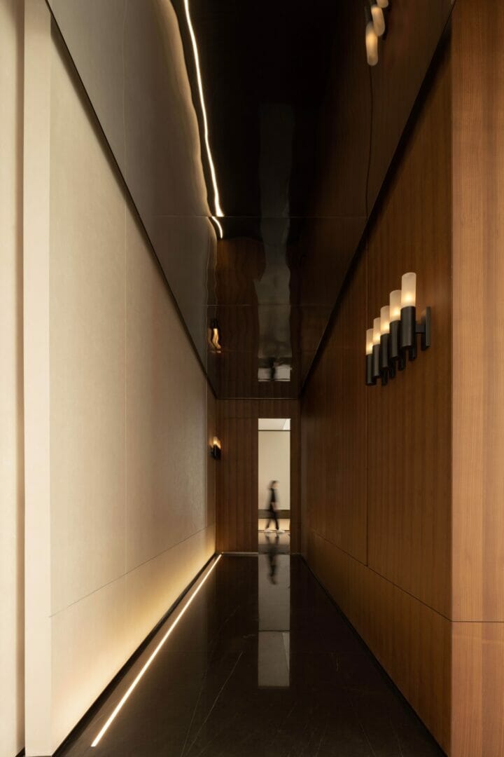
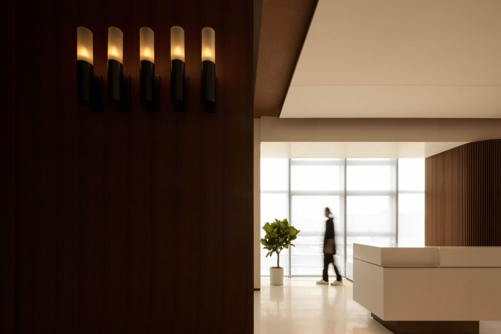
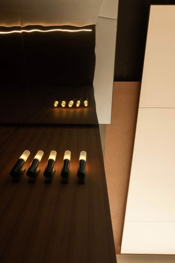
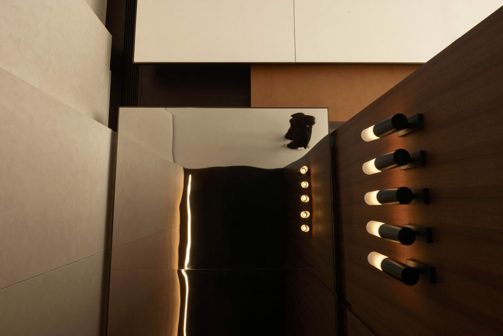
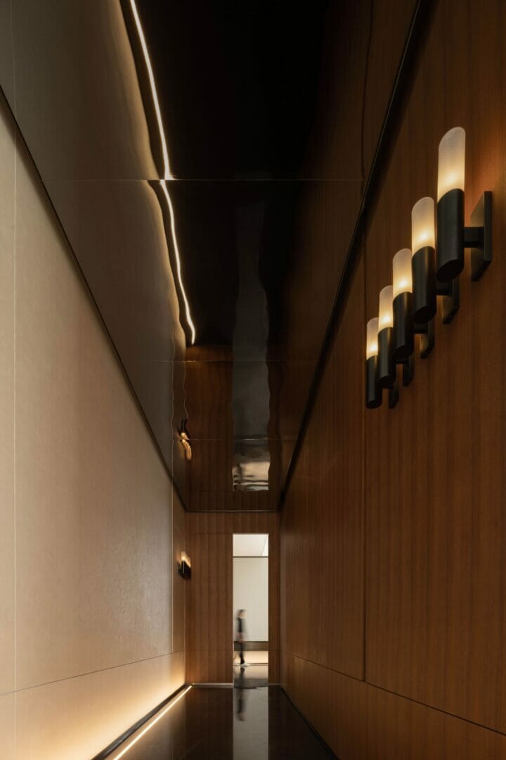
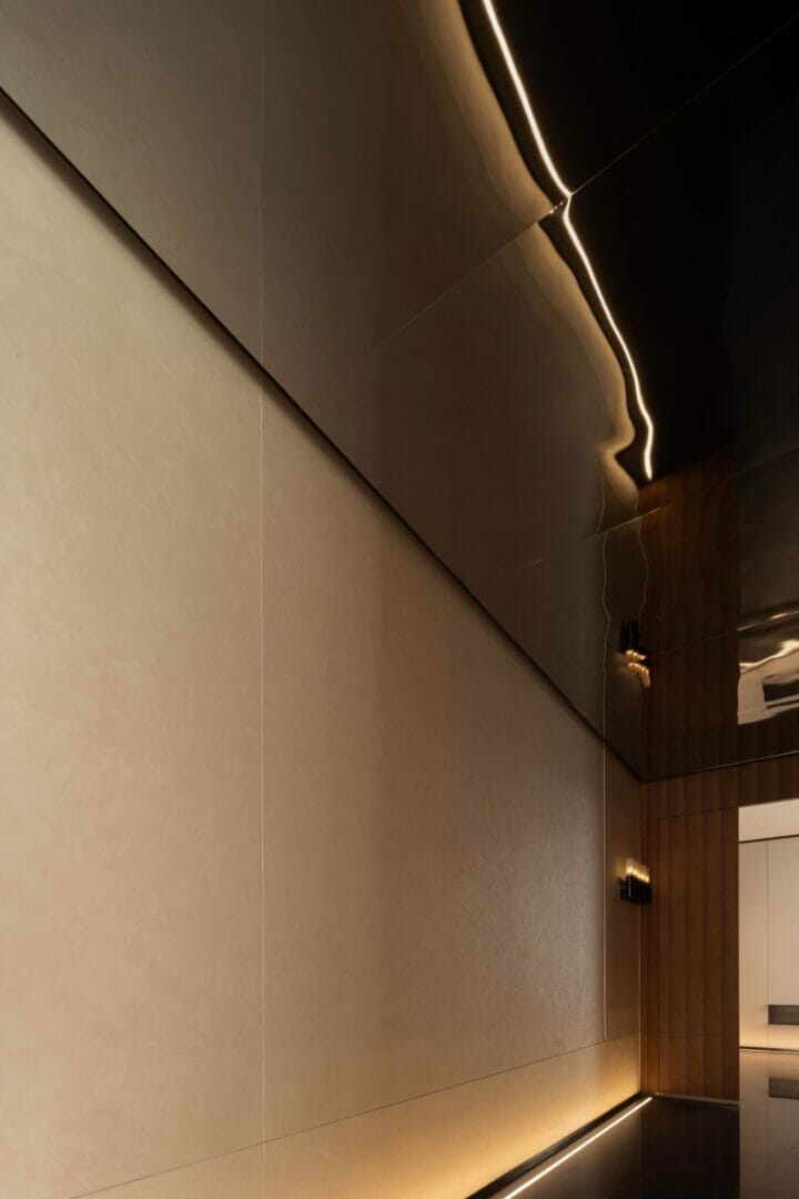
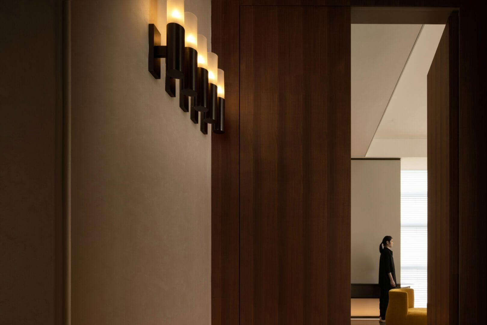
The path to the VIP room avoids using dazzling lights and decorations. Instead, elegant wall lamps light the way, creating a natural experience.
To the right, the scale model area sits at the corner of the L-shape layout. Natural light and scenery from both sides create an open and bright atmosphere. The left-right polarity further highlights the contrast between private and public spaces.
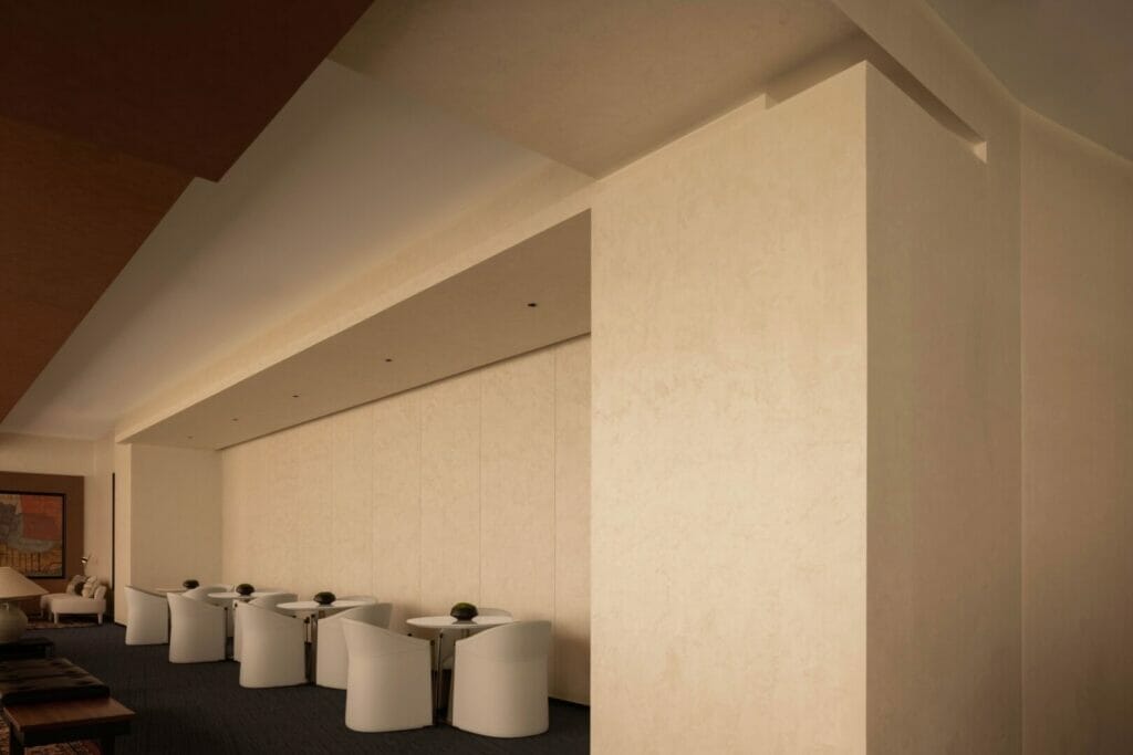
The bar is located between the multi-purpose area and the negotiation area. Placement in the middle of a transparent and narrow space makes a slight detour from the circulation path to avoid a secluded location. This procures a direct and clean installation, following the overall style of the project.
The bar area seems to use several decoration blocks in its construction. In fact, the shape is unintentional. The design follows the structure of the building in a smart way.
The metal columns in the area enrich the atmosphere and echo the ones found in the reception hall, creating a concise temperament throughout the project.
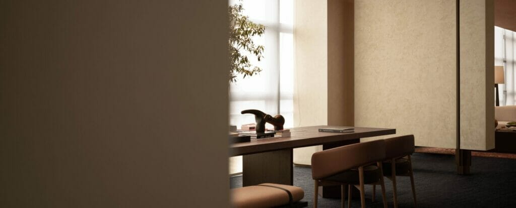
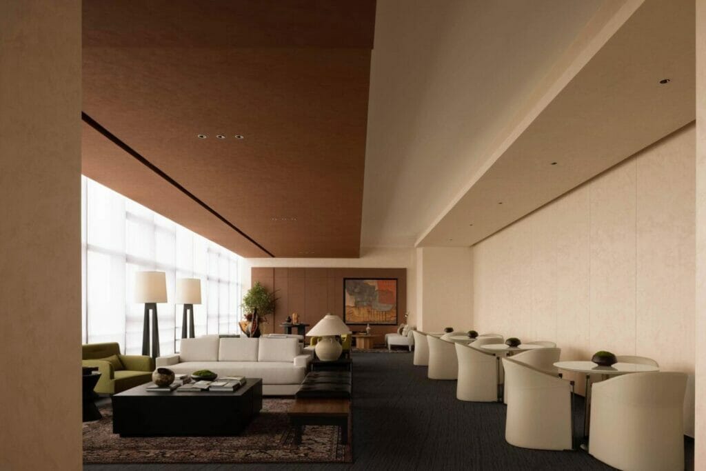
Walking through the space produces a genuine and comfortable feeling. An atmosphere of trust and understanding facilitates communication in the negotiation area, stimulating business engagement.
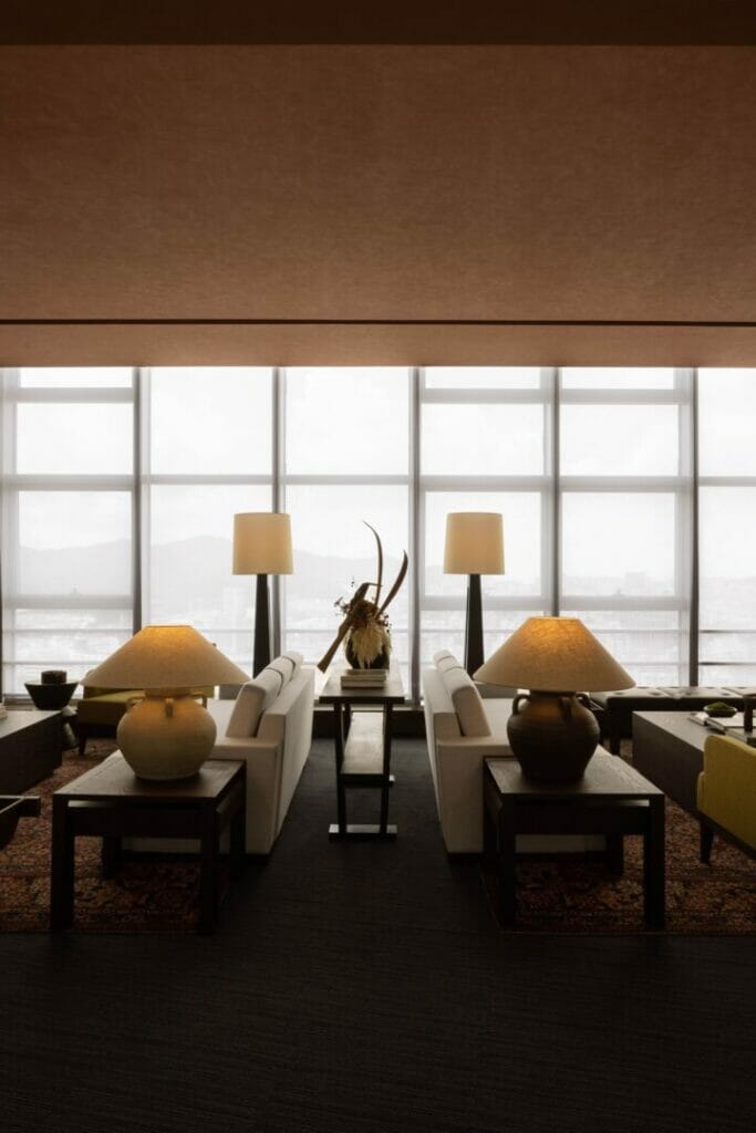
One side of the negotiation area lets in a considerable amount of natural light, while the opposite wall is designed as a visual interspace. The structural blocks are cleverly borrowed to create a sense of space, while sets of blinds offer different atmospheres as the day flows.
This is also the best viewing location. Here, the indoor and outdoor landscapes blend together. One can simply relax between mountains and seas, in a carefree and joyful corner of the world.
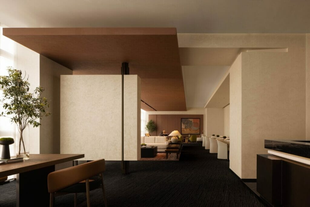
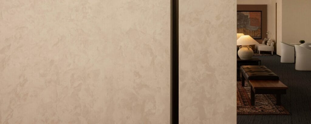
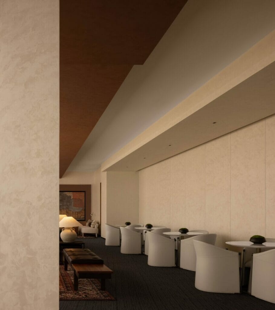
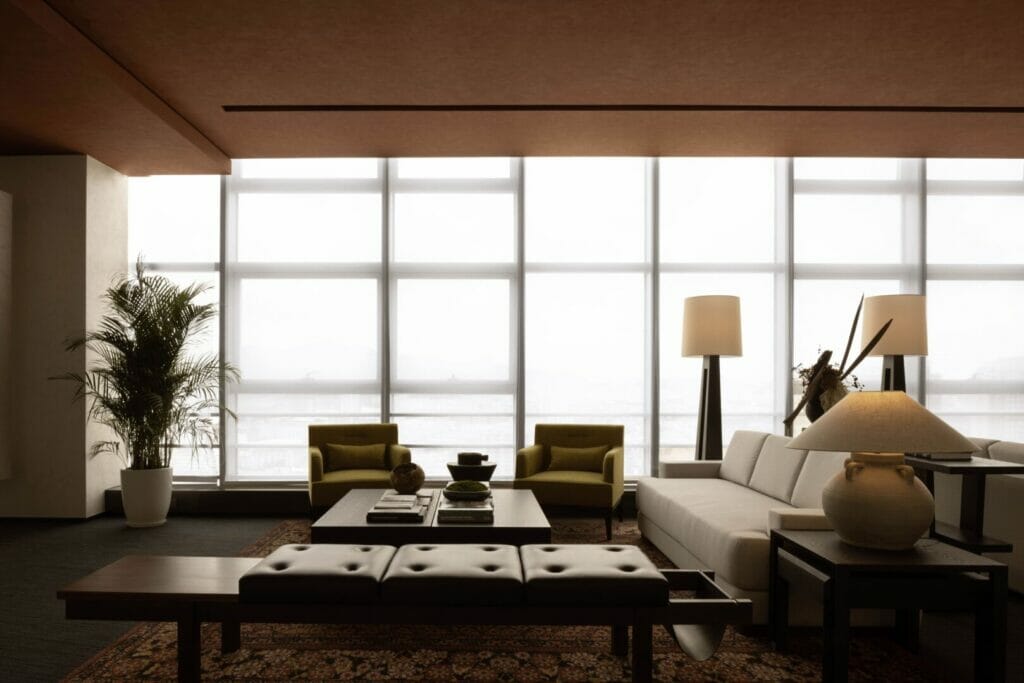
Wood veneer and texture paint applied to the ceiling provide a natural spatial orientation. At the same time, the floor’s mild tones and neutral materials create a floating sensation and gracefully portray the glass curtain wall.
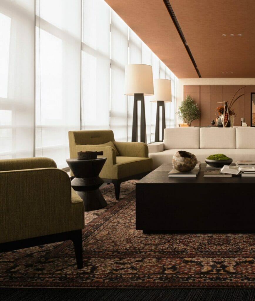
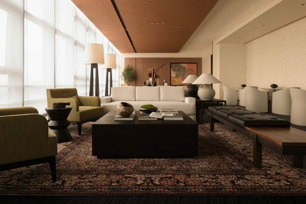
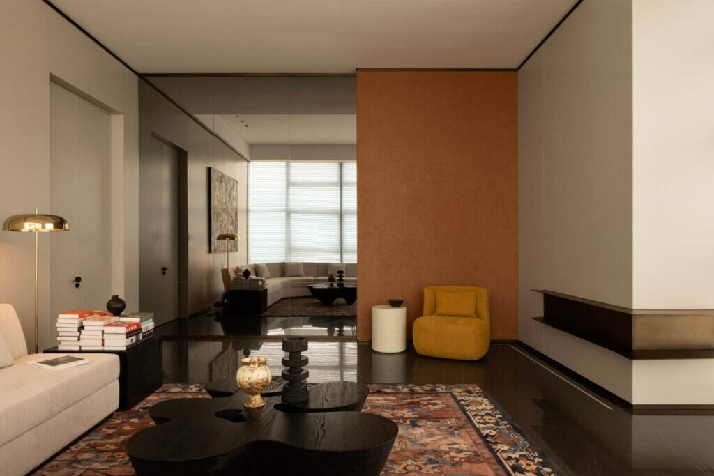
The sofas and carpets are made of first-class raw materials like cotton and hemp. Under the natural light, the fabrics showcase warm and subtle changes. Careful integration of colors, materials, spatial scales, and other elements creates a friendly and welcoming atmosphere.
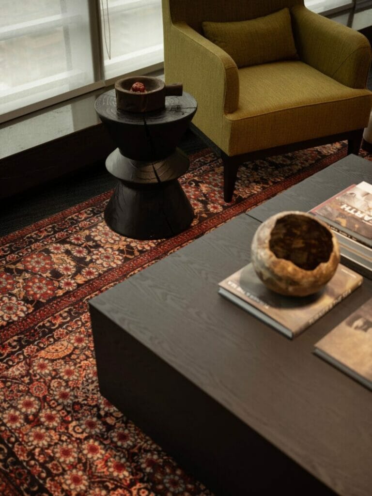
A Persian rug at the center of the room enriches the area with subtle patterns. Tables and chairs with rounded lines can be arranged in various ways, adding freedom and flexibility to the functional space and providing different textures for daily use.
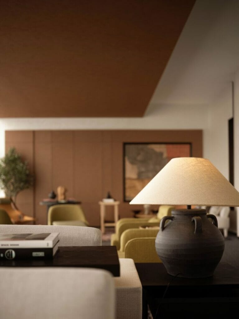
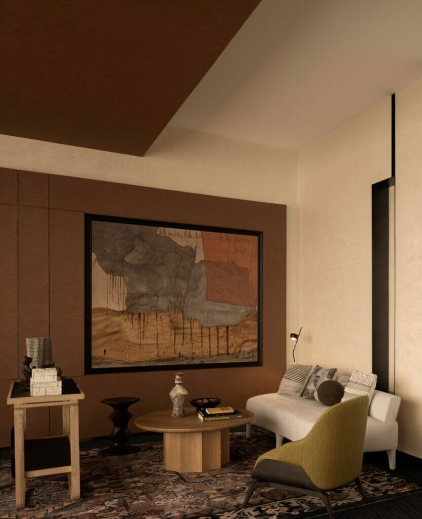
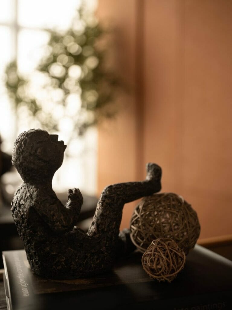
Lamps, paintings, sculptures, and other art pieces decorate the space. Most works were crafted by emerging artists to avoid a commercial atmosphere. This grants a unique flavor to the project, a cozy atmosphere like the one found at home.
A sense of belonging can be felt in the rich details of the space. Tea tables, shelves, armchairs, and plants, are all elements that grant character to the project. They enliven the atmosphere and create a harmonic visual rhythm.
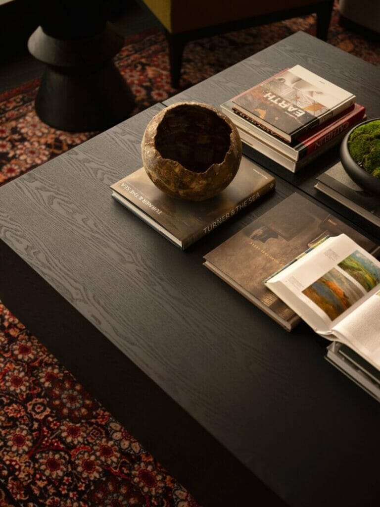
Books, magazines, cups, and dishes on the coffee tables nurture the sensation of being comfortable at home. The design integrates functionality and aesthetics, creating a complete and harmonious spatial experience.
Project Information
- Project name: Shenzhen Yanlord Qianhai Dream Park Sales Center
- Project location: Xinqiao Street, Bao’an District, Shenzhen, Guangdong Province, China
- Website: www.mypchina.com
- Project type: Interior design, interior renovation and accessorizing
- Project status: Built
- Client: Yanlard Real Estate
- Design period: 2021 November – 2022 March
- Construction period: 2022 March – May
- Interior space: 600 square meters
- Chief designer: Ma Yiping
- Interior design team: Ma Yiping Design
- Accessorizing team: Ma Yiping Design
- Photographer: Ouyang Yun
- Main materials: inorganic crushed stone, Bulgarian gray marble, texture paint, wood veneer, bronze.
ABOUT HEAD DESIGNER
Mr. Ma Yiping
Founder and creative director of MYP Design
For Mr. Ma Yiping, design is the hero that always saves the day. Through design, he explores the rhythm of life, the pursuit of aspirations, decision-making after careful thought, and even softest and lightest touch. Overall, he advocates the will to persevere and push forward. In his own words, design should not exist for the sake of it; but to follow a poetic stance that confronts the mediocrity and crudeness of life.
Since its establishment over a decade ago, the design firm has created a cornucopia of indoor design solutions for well-known real estate companies such as Shimao Property, Yanlord Land Group, Zhongzhou Real Estate,Shenzhen SDG Investment Development, among others.
MYP Design has broken through typical obstacles in the industry such as unreliable service and challenges of implementation while developing an excellent balance between cost and efficiency.
ABOUT MYP Design
MYP Design is a professional, authentic and dynamic design studio that applies a visionary approach to projects developed for mid-to-high-end enterprises. MYP Design customizes every minor detail to deliver design beyond imagination and superior brand quality. The company’s founder, Mr. Ma Yiping, leads a dynamic team to implement innovative and realistic design approaches that change space and life, creating a spiritual realm for the end-users of the space.
Get in touch

