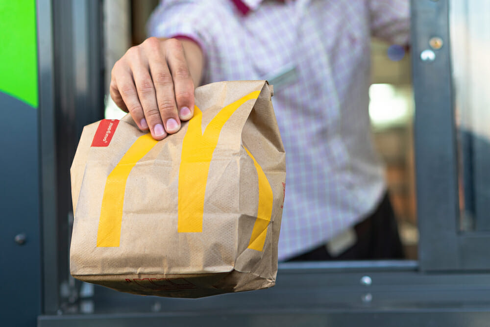
As you stroll along the main street, perhaps with a few shopping bags in your hands, you take a quick glance at your watch. It is one o’clock. Time for lunch?
You look around and see fast-food signs all over the place. All of a sudden, your stomach starts rumbling. Is it your digestive organ being overly greedy? The honest answer is, well, no. In truth, you may have your subconscious to blame for such an unexpected pang of hunger.
For years, fast-food chains have been taking full advantage of color psychology to grab potential customers’ attention. They want you to step inside their restaurant to relax in the company of a hot drink or to snack on burgers and fries forevermore.
Electrix, manufacturer of stainless steel enclosures, has looked at the color scheme in the logos of 50 accomplished international fast food brands. Color by color, we explore how and why they impact the success of restaurants.
Red
All hail the king! When it comes to food and appetite, red is the sovereign of persuasive colors. Recognized as the shade of power and passion, making your heart race and increasing your nerve impulses, red also enhances your hunger while inciting a physical response. It is no surprise, therefore, that most fast-food chains feature this color in their logos and packaging.
Indeed, out of the 50 brands we evaluated, 32 use tones of red in their restaurant logo. As your neurons slowly fire up in the brain’s hypothalamus, you will automatically start associating the color red with juicy meat and sweet goodness. No wonder you become uncontrollably hungry!
White
The color white cannot be adopted by itself for obvious readability issues. Nevertheless, it works wonders when incorporated inside colorful logos or as their base. It saves them from being too messy and gives them a touch of cleanliness and simplicity.
This is why it is the second most used color, with 20 fast-food chains selecting it as an integral part of their brand’s image.
Black
While not the most popular choice in the past, black has gradually been rediscovered as a positively impactful color for restaurants. In fact, 16 logos out of 50 use black elements within their design.
As well as being the best color in terms of readability, black portrays a sense of class, elegance, and sophistication. Just like a refined black truffle, it enhances the consumers’ perception of high quality and value. Quite simply, you cannot go wrong with black!
Yellow
A faithful and effective companion of red logos, yellow tends to be paired up with other colors. As with white, if it was left to its own devices, the restaurant’s name would be difficult to read.
That said, yellow is the color that our brain processes the fastest, and it has the ability to grab consumers’ attention. What’s more, studies show that looking at the color yellow releases serotonin, a ‘feel-good’ chemical. This may suggest that buyers are not only attracted to yellow but may genuinely be happy with the meal they have just purchased too.
With its uplifting and striking appearance, it is easy to see why 15 brands out of 50 have opted for the color yellow to advertise their fast-food chain.
Blue
This may surprise you, but the color blue is actually a big turn-off when it comes to food.
Blueberries excluded, can you name any other natural blue food? Probably not. The mold that patches your expired bread is blue and, in all fairness, it is not particularly appetizing. Anyway, research suggests that blue tends to suppress your hunger.
If handled carefully, however, it can work. 11 brands out of 50 have blue elements in their logo, which is not too surprising when considering that most people like its different shades of color. Moreover, blue evokes sentiments of dependability and trust – something that restaurants are very happy to be associated with.
Green
As consumers become increasingly aware of the importance of sustainability, green is the main color associated with health and wellbeing. It also encourages relaxation because of its correlation to nature and the environment.
9 of the 50 logos feature green details in their design. Some may subconsciously be hinting to sit down at their restaurant table and relax. How could you possibly refuse a similar offer?
Orange
A blend between the colors red and yellow, orange encourages impulses and tends to stimulate all senses – which, ultimately, is exactly what a restaurant wants. 9 fast-food chains out of 50 adopt orange as part of their company’s image as it lends itself well as an appetizing color.
Not only that, but studies have also found that consumers view orange as a color for affordability. This is a good expedient for restaurants to attract customers who are in search of a decent-priced meal.
Pink and purple
Pink and purple are not very popular options, with only two and one of the fast-food chains utilizing them in their logos respectively. Pink tends to activate a desire for sweets and sugar and, therefore, may be better suited for dessert-focused businesses.
As for purple, it is a color that portrays wisdom and spirituality, which does not really suit a restaurant’s purpose. That said, it may be an original alternative to both steer away from traditional warm colors and make the company’s logo more memorable.
Over the years, fast-food restaurants have perfected the composition, style, and color of their logos. The next time you are in town and your stomach starts crying for food, you will know that it is not just you being greedy. It is instead the brand colors working their magic on your subconscious.
