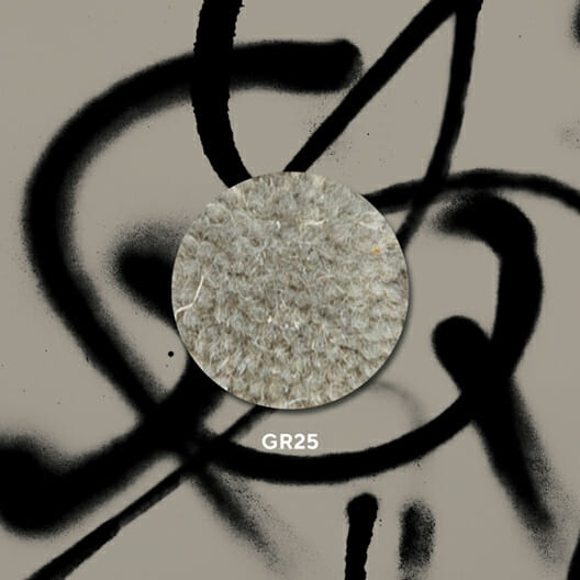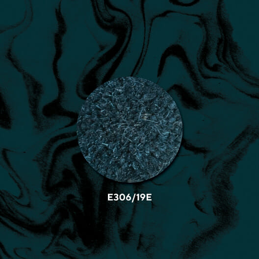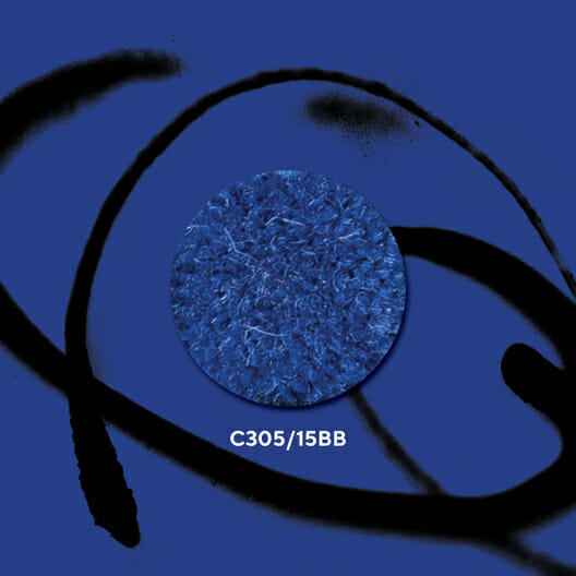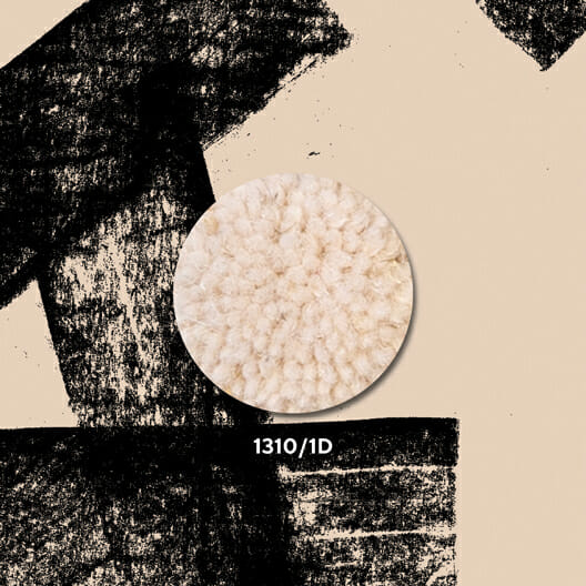
Luxury carpet manufacturer, Royal Thai, were excited to announce the launch of Pastiche, a new design collection influenced by the company’s brand architecture hand in hand with a bold new brand color palette.
Taking cues from the arches, movement and textures that make up the Royal Thai brand architecture, Pastiche is a celebration of being inspired by everything.
Defined as a musical, literary, or artistic composition made up of selections from different works, Pastiche (n) succinctly defines the hospitality world. Product makers and interior designers come together, piecing together brand, location, and historical narratives to build unique spaces the world over.
Using wool as the medium and flooring as the framework, Pastiche is a combination of perspectives pooled together by our diverse team of creatives.
Blended textures, swirls, and repeating linear elements are combined into 11 compelling carpet compositions–both in Axminster and Hand Tufted constructions.
Designers can see whispers of the company’s brand textures, cascading between layers of expertly placed pixels, using multiple styles like cubism, traditional floral, graphic street art, mid-century modern, and retro era patterns. Even deconstructed pieces of the Royal Thai logo peak between torn paper edges in a carved Axminster rug design.
When working with Royal Thai and utilizing the skilled craftspeople in their vertically integrated Thailand-based facility, design narratives can confidently be translated into wool- rich floor coverings.
Pastiche asks “what’s your story?” And undoubtedly answers “let’s write it in wool.”
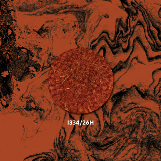
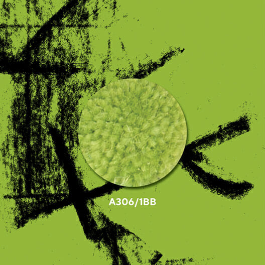
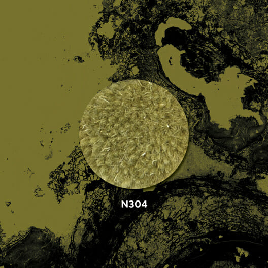
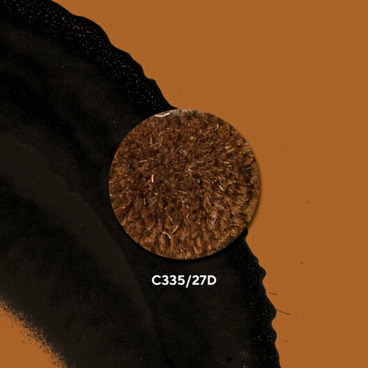
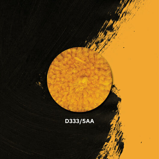
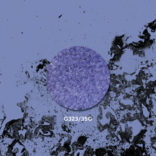
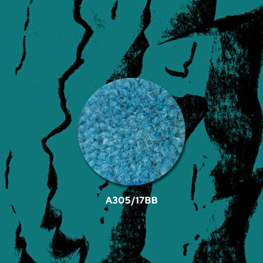
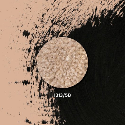
Hand in hand with Pastiche, the company has launched a bold new brand color palette. Like an interior concept, understanding color hinges on how things are combined. When viewing color, you are always digesting the hue in the context of others.
In Interaction of Color, Josef Albers explains: “We are able to hear a single tone. But we almost never (that is, without special devices) see a single color unconnected and unrelated to other colors. Colors present themselves in continuous flux, constantly related to changing neighbors and changing conditions.”
The new Royal Thai brand color palette, consisting of a dozen fresh hues directed by the company’s product poms, reflects the industry’s appetite for creative expansion.


Inspired by color theory practices, where designers pull colored paper and remix different combinations to find successful and interesting color concoctions, the design collection is housed in a branded pocket of postcards. Instead of flipping through a bound brochure, designers can see the palette, including color names like Crocodile, Peppered Earth, New Heights and Aegean Deep, brand textures and collection patterns all out together on the table – visually digesting all the elements at once.
Launching Pastiche simultaneously with the 2023 brand color palette is a celebration of our industry, the grit of hospitality, the innovation of boutique design and the hope for a colorful future.
Pastiche debuted November 13th, 2022 at Boutique Design New York (BDNY) in New York City on booth #443.


